I don’t want my projects to be all over the place, color-wise, so I’ve decided to work on the kind of palette I’d enjoy drawing in.
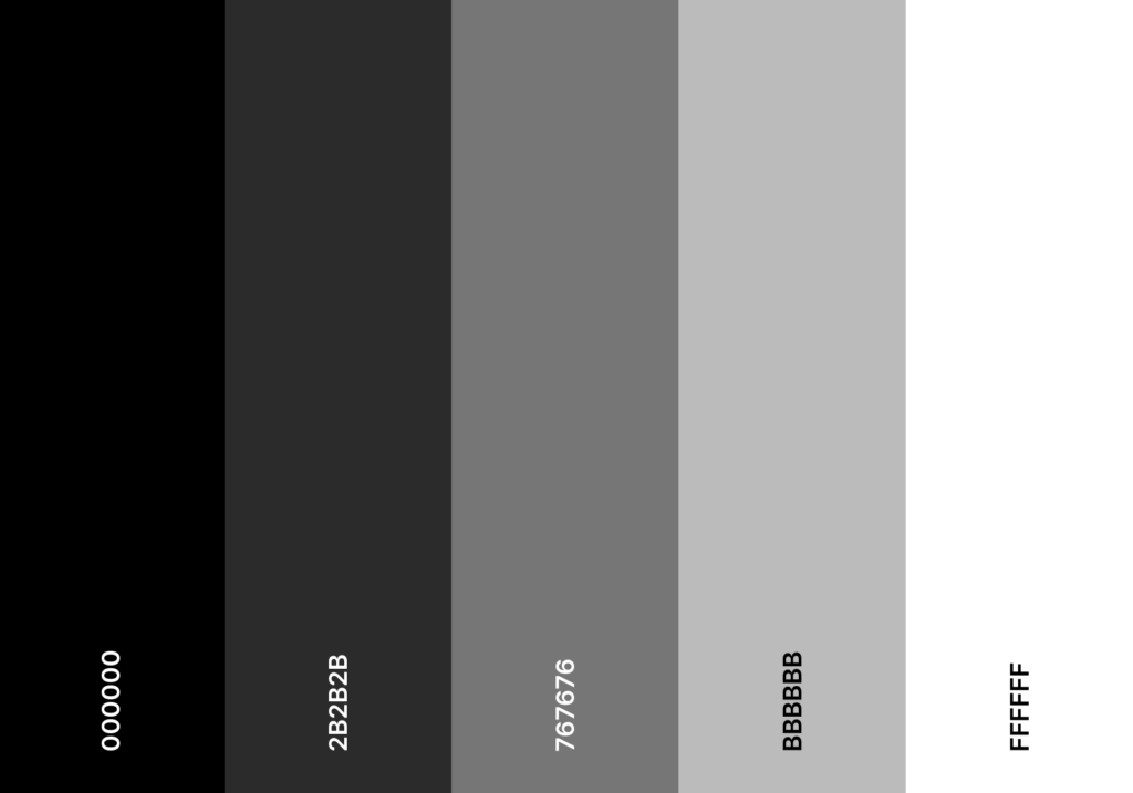
My first decision was a simple grayscale palette. I used it to draw the two Shadowdark maps I created for my husband’s scenario. I was able to assert that they work for me—the grays are sufficiently different to be used in contrast with each other, and still look good (at least to me).
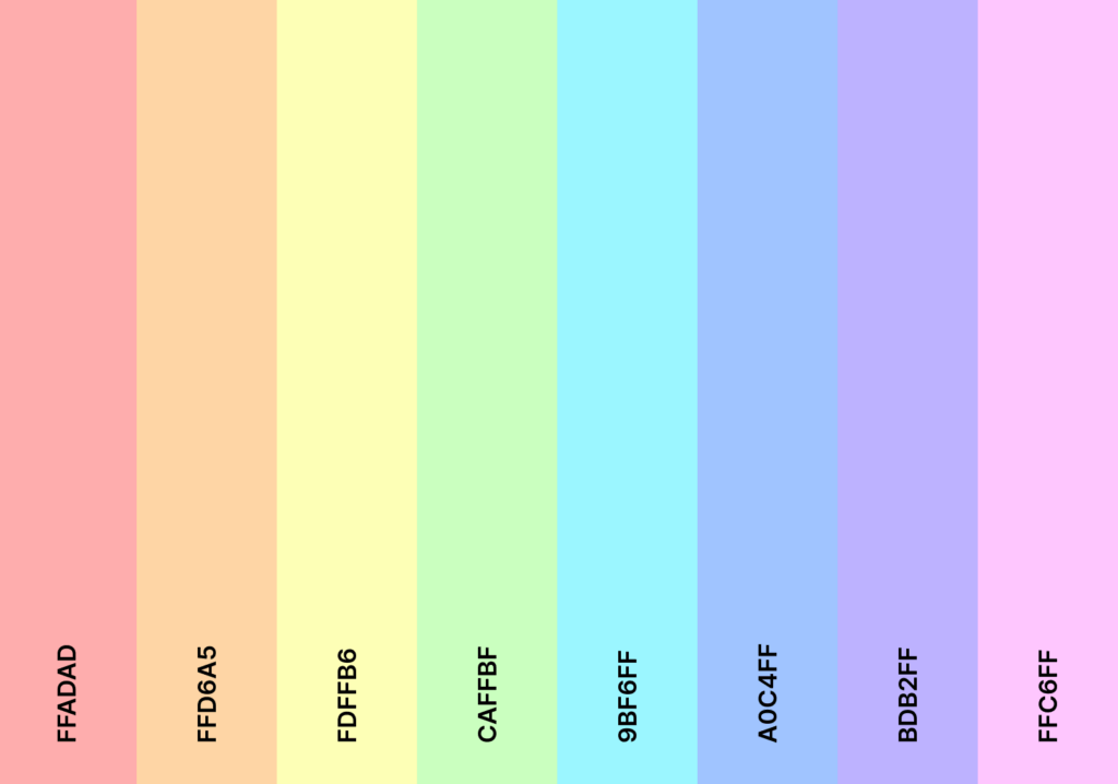
Then, because I love rainbows and pastels, I chose the following colors for future illustrations.
I still have to refine my drawing style (which is one of my goals this year), but I think I will lean in both kawaii and spooky themes. I believe that merging pastels with darker colors might look nice, more on that later, hopefully!
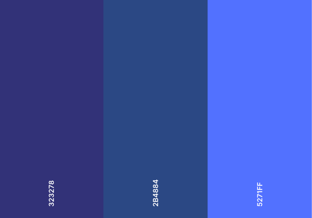
And then, I wanted to get my blues in. My #5271FF, of course, and then two others that could work with it in future illustrations.
Are these palettes definitive? No. I still have to test them out, but from my experience with drawing on Procreate, similar colors have worked for me in the past. I’ll use them as a basis and might modify or expand them later, if I decide it is better.
If you want to use the same swatches as me, you can download them here and import them in Procreate:
Since this is finally done, I might have an easier time starting on one of my projects (eliminating barriers usually helps, fingers crossed!).

0 Comments